Branding: Mountainside Grappling.
Building the look for a new jiu jitsu promotion we named Mountainside Grappling.
Over the course of my first few years in Denver I've built some amazing connections within the combat sports communities. When a few of my old teammates began discussions of starting a new grappling promotion a couple of years ago I jumped at the opportunity to buildout the branding & identity for them. We worked on the overall look together and they gave me free reign to take it where it needed to go as we built Mountainside Grappling together.
The first step was naming the promotion. I strongly suggested staying away from any of the most common terms typically found in business here: 303, Mile High, Peak, Rocky Mountain, and 5280. While understanding the urge to connect your business to the area you operate in, this feels lazy to me. And with so many companies using these terms in their business name, it is also lumping them all together which doesn't allow them to stand out. Using the word "mountainside" solved the problem of wanting to stay connected to the area without using the same words as so many others.
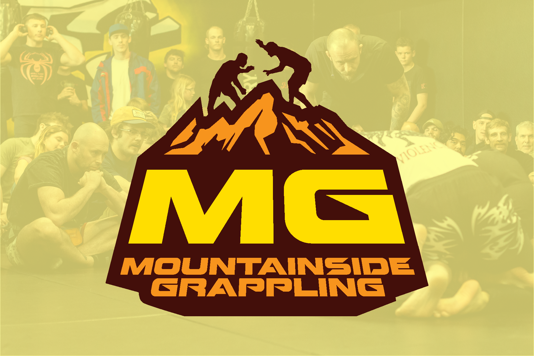
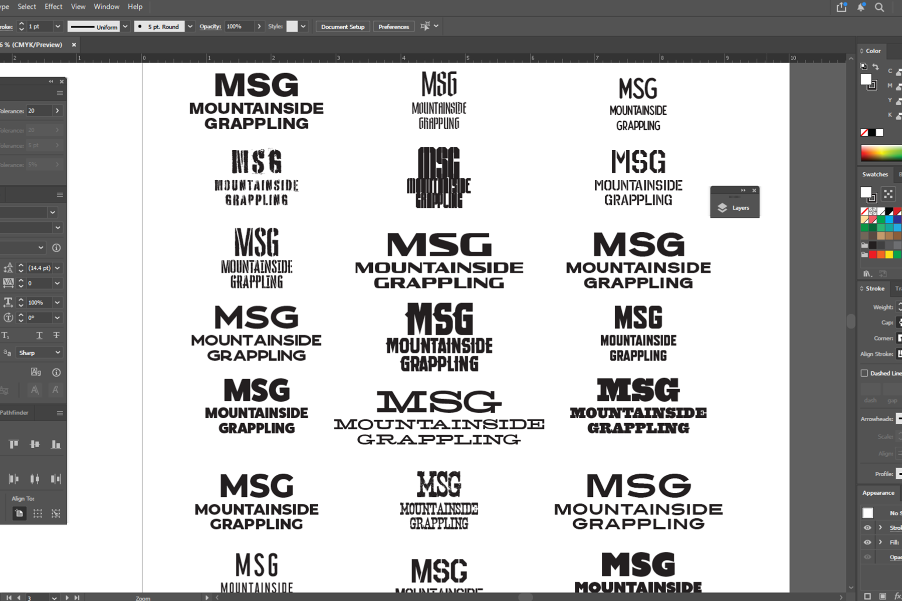
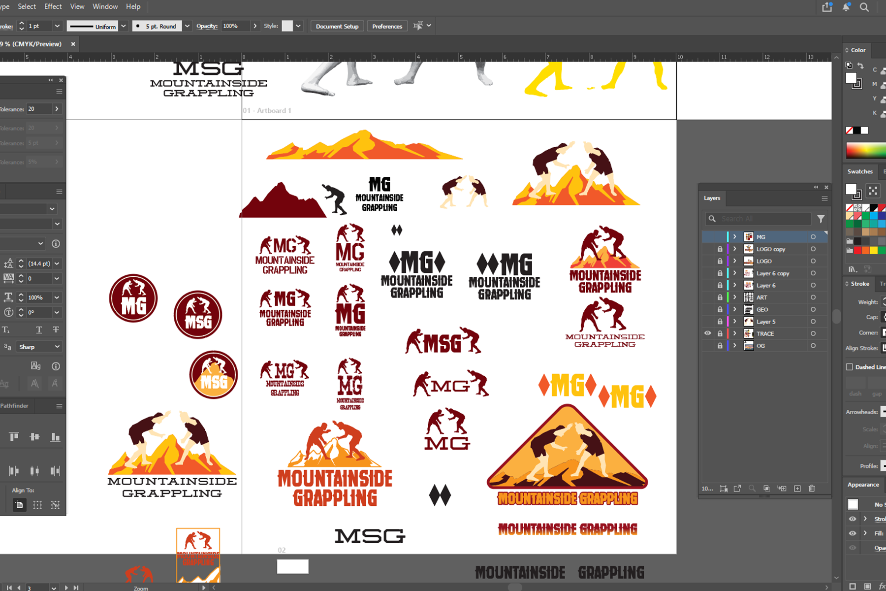
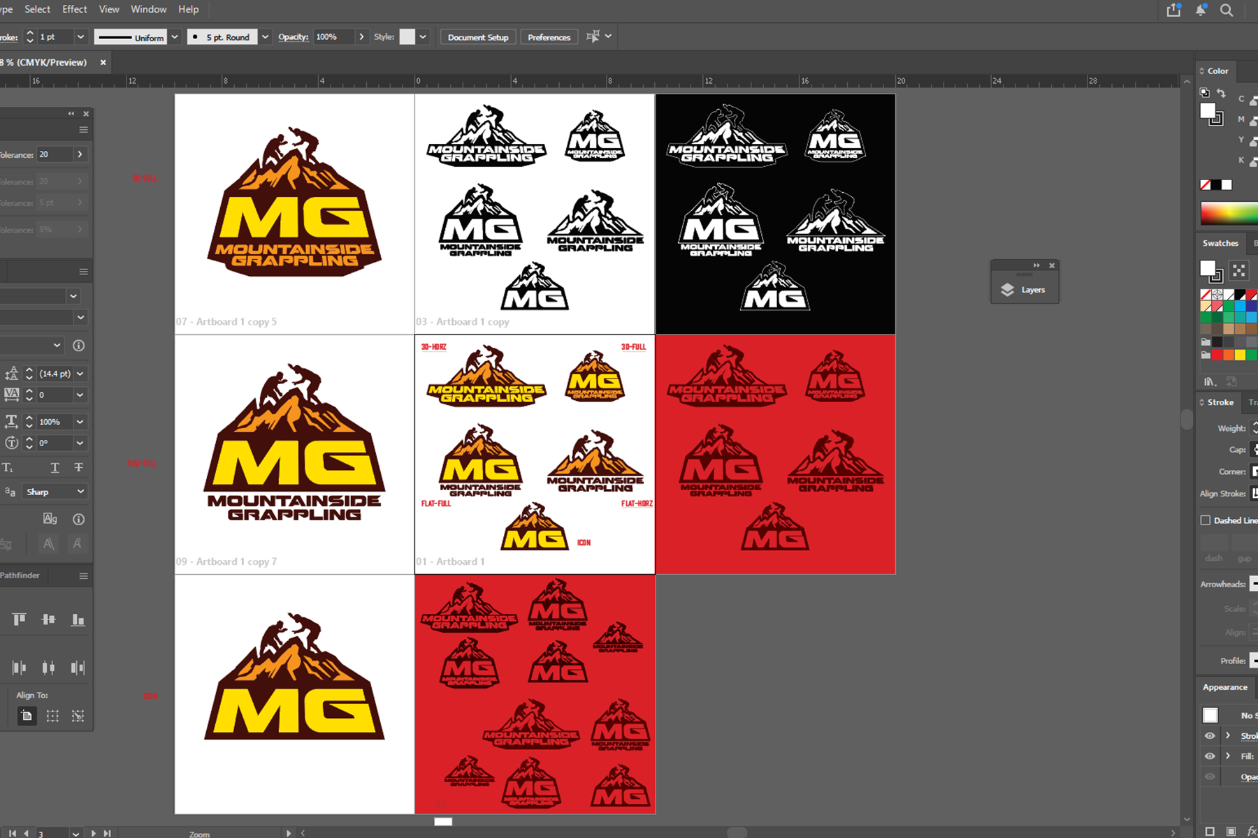
The next steps for me were creating a meaningful icon to represent the organization and building other lockups around it. Using photos of local grapplers I built the main logo to include them battling on top of a section of the Rockies with the initials and name underneath to bring the logo together. From here I finished out the look with other wordmarks and icons giving the guys a few options for flexibility in the future be it for promotional graphics, awards, merchandise, and so on. This is a project I am very proud to be a part of given that this community is so close to me and I had a blast creating the look with these guys. It is even more meaningful as this organization does a lot for its competitors and for the community as a whole putting on amazing events.
The first step was naming the promotion. I strongly suggested staying away from any of the most common terms typically found in business here: 303, Mile High, Peak, Rocky Mountain, and 5280. While understanding the urge to connect your business to the area you operate in, this feels lazy to me. And with so many companies using these terms in their business name, it is also lumping them all together which doesn't allow them to stand out. Using the word "mountainside" solved the problem of wanting to stay connected to the area without using the same words as so many others.
The next steps for me were creating a meaningful icon to represent the organization and building other lockups around it. Using photos of local grapplers I built the main logo to include them battling on top of a section of the Rockies with the initials and name underneath to bring the logo together. From here I finished out the look with other wordmarks and icons giving the guys a few options for flexibility in the future be it for promotional graphics, awards, merchandise, and so on. This is a project I am very proud to be a part of given that this community is so close to me and I had a blast creating the look with these guys. It is even more meaningful as this organization does a lot for its competitors and for the community as a whole putting on amazing events.
Mountainside Grappling is a grappling promotion operating in the greater Denver area.
For all of your illustration and creative needs, please contact me directly at:
blue73100@gmail.com